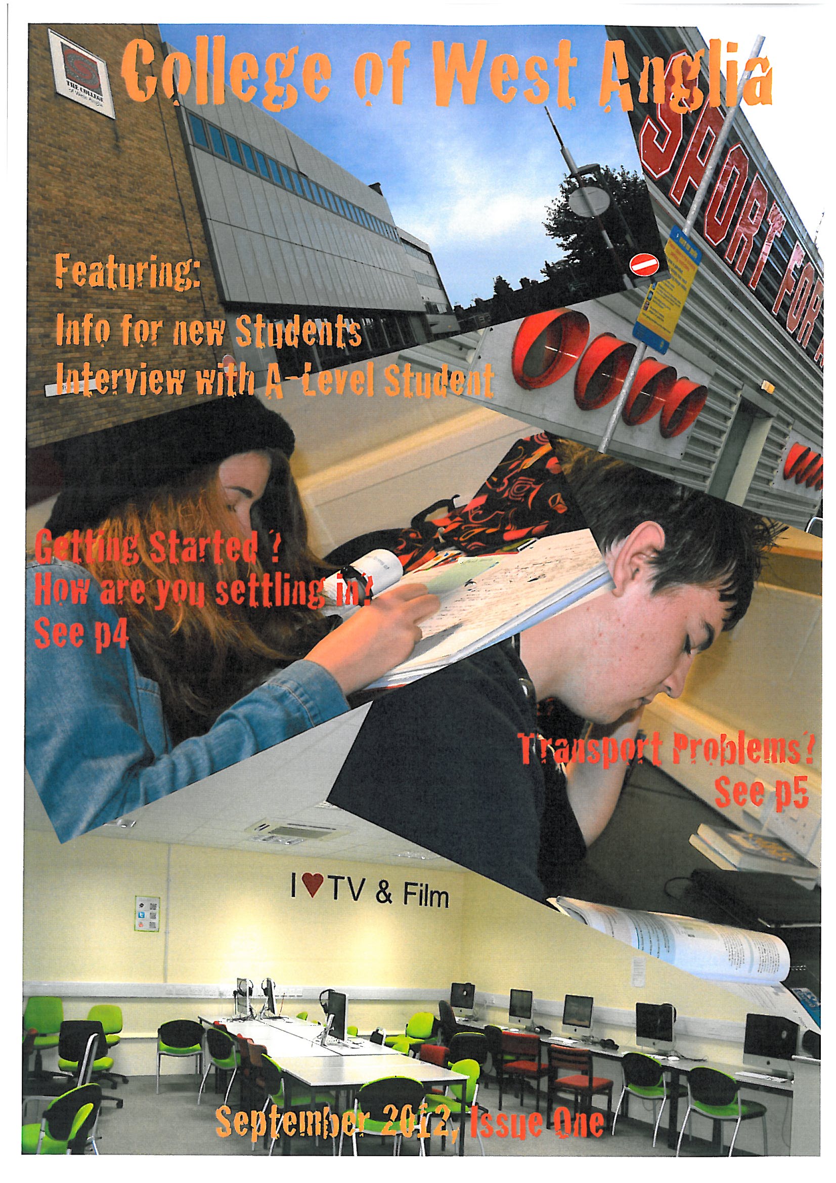
This is the next stage of the development of my title page for the college magazine. As you can see I have taken photos of the campus and fellow students.
I used "Adobe Illustrator CS5" to create the fonts instead of using http://www.dafont.com becasue I felt that they didnt appear the be that appealing for the magazines target audience.
Then I used "Adobe Photoshop CS5" to crop and alter the "levels" of contrast in teh images. Using "Adobe Illustrator CS5" again I rotated the photos to make the title page become more appealing (that I feel that I have achieved").
I will have to do another copy of this magazine cover because I need to change the images of the students to Medium Shots instead of Over the Shoulder Shots.
No comments:
Post a Comment