Friday 22 March 2013
Final Front-Page of Music Magazine

As you can see I edited the pervious design by enlarging the text which was already present in the design because I felt that the pervious design was to empty and most professional published magazines contains as much information as possible but always have order in mind, so that the magazine does not look over crowded.
The texts which is enlarged:
•"Featuring: MC Cronic"
•"DRUM & BASS AWARDS 2013"
•"EXCLUSIVE: GROOVERIDER SEE P6"
•"Interview with MC Cronic"
In addition I added in a skyline which advertised a limited edition CD inside and a competition available to enter via the magazine's website: www.D&BassMagazine.co.uk.
Friday 15 March 2013
Final Desgn of Two-page Spread

The image was edited by using image manipulation software (Photoshop CS6) by deleting the background, layering it on top and flattening the images together. Also I added a quote from MC Cronic "DJ Grooverider in my Idol & Inspiration" to fill in the empty space. I am pleased with the outcome and potentially reaches the necessary standard.
Final design of Music Magazine Contents page

This is my final design of my contents page, I have used three images in this design with relevant information also with a suitable scale for the page numbers. If this was to be professionally published I would have to seek permission from both Twitter and Facebook authorities to use their logo and company names to avoid breaking the copyright legislation.
Tuesday 12 February 2013
Contact Sheet 2 & Editting Using Photoshop CS6
Contact sheet of Image used for the contents page:

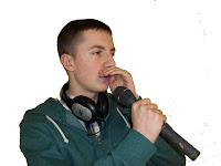
DSCN0002.JPG- I flipped this iamge using the "Flip Canvas" Tool in Image Rotation Settings, I also used the Magaic Eraser Tool to delete the background.
DSCN0003.JPG- I had to take this image twice because whilst using the "Magic eraser tool", I realised that it would not work, the dark background clashed with the dark skin tone of the subject therefore I took the image again using a white background.
DSCN0003.JPG DSCN0005.JPG


DSCN0003.JPG DSCN0005.JPG


Editing Image1 using Photoshop:
Problem with Magic Eraser Tool:

As you can see by using "Magic Eraser Tool" erased the black background as well as his hair because the two shades of black clash therefore I retook the photograph on a white background.
Solution to the problem:
After retaking the photograph the Magic Eraser Tool successfully eraser the background without effect the image.

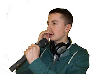
Image 3- I used the magic eraser tool to delete the background once agian and then I layer all three iamge on this page.


Contact Sheet 1 & Editing on Photoshop CS6
Here is a contact sheet created using photoshop CS6 to indicate the photographs which I discarded and used the my music magazine assignment:
I will list the JPEG code for the images I used in this assignment:
I only used two images from this contact sheet, other image from second contact sheet.

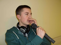
101_0448.JPG x 2 I used this image twice but edited differently by going into "Image", "Image Rotation" then "Flip canvas horizontal" the position of the person change flipping him the opposite direction. I also used the "Magic Eraser Tool" to erase the background and then layer the image on the same image as the Mast-Head and Sub-Titles.
101_0446.JPG_ I manipulated this photograph in the same way as the previous one by "Flipping Canvas Horizontal" making him look the opposite way. I also used the "Magic Eraser Tool" again to erase background so that I was just the figure of the person only.
Before Magic Eraser Tool
After Magic Eraser Tool
Before "Flip Canvas Horizontal"
I will list the JPEG code for the images I used in this assignment:
I only used two images from this contact sheet, other image from second contact sheet.

101_0448.JPG x 2 I used this image twice but edited differently by going into "Image", "Image Rotation" then "Flip canvas horizontal" the position of the person change flipping him the opposite direction. I also used the "Magic Eraser Tool" to erase the background and then layer the image on the same image as the Mast-Head and Sub-Titles.
101_0446.JPG_ I manipulated this photograph in the same way as the previous one by "Flipping Canvas Horizontal" making him look the opposite way. I also used the "Magic Eraser Tool" again to erase background so that I was just the figure of the person only.
Before Magic Eraser Tool

After Magic Eraser Tool

Before "Flip Canvas Horizontal"
After "Flipping Canvas Horizontal"
Draft 1 of double-page spread for music magazine

This my first design using photoshop CS6, again I put the Mast-head of the magazine into the design as I changed the design to the perious rough drawing by moving the text box and questions, hich created room on the other empty side to layer the image on top.
Rough Sketch of Double-Page spread for Music Magazine

This is my rough drawing of my double-page spread, again you can see that I drew this perious to the changes of the Mast-Head. I will be interviewing MC Cronic with a series of questions relating to Drum & Bass as well as his Background.
Draft 2 of contents page for music magazine

I looked at NME magazine's contents page and they influenced me to change my contents page design. I used their content design as a template fo this design.
Draft1 of contents page for music magazine

I used the Mast-Head (Logo) of the Magazine and continued its onto the contents page and the same colour theme of Red Background with White Lettering from Title Page. This shows continuity in my work. I like the idea of using vertical text on the side of the page, and I used boxes to show where the iamge will be going. I feel that I have used the right scales of number for the pages but in future I might feel inclined to change this.
Thursday 7 February 2013
Rough Sketch of Contents Page for Music Magazine

This is my first rough design of my contents page, as you can see I drew this before changing the Mast-head thats why the Mast-Head is different to my perious post.
6th Design for Music magazine front cover

This design was going to be my final product of my music magazine, I decided to editing one last time but it didn't have the professional"Edge" that I desired. I Designed this magazine used photo manipulation software (Photoshop CS2 & CS6). I created the barked on www.dafonts.com
I took several photographs of my peers in my Media Class, Unfortunately most of the photographs I took turned out blurry,the lighting incorrect or the background was difficult to erase using the "magic eraser" tool in photoshop. So I discarded many of the photographs and only used 5.
Draft 5 of Front Page for Music Magazine

I changed thee design of the Mast-Head again I made the "RUM" (from Drum) and "ASS" (from Bass) lettering different. I liked the effect that thee captial letters in "ASS" provided. I also put boxes to indicate where the images could be.
Draft 4 of Front Page for Music Magazine

I decided to change the design to the Mast-Head because it didnt fit into the designs which I have looked at e.g. NME and I want my magazine to look like an actual magazine published professionally.
Draft 3 of Music Magazine front Page

As I wrote on my perious post I think that Red & White theme complement each other better than Blue and White theme. I designed this on Photoshop CS6, I used the same font 'Roman New Times' but by changing the style e.g. Bold, Italic, Normal or Blod Italic which kind of keeps continuity but with slight differences. I do not feel that the Mast-Head is suitable for a Magazine and I will try other designs.
Draft 2 of Front Page for Music Magazine

The colour scheme was kept the same as the original design in publisher but I found a blue which grabbed your attention. I design this in Adobe Illustrator CS6. After reflection I feel that I should try Red background with White lettering because the two colours compliment each other better than blue & white.
Orginal Design of Drum & Bass Magazine

I created this design using Microsoft Publisher, as you can see the Mast-Head does not conform to the excepted style of "Magazine" because a magazine's mast-head is located up in the left corner so that when stacked on selves you can identify the different magazine. Also there are not enough information (Sub-Title) in this design.
Rough Sketch of Front Page of Music Magazine

This is a rough drawing of my idea of Interviewing Drum & Bass MC Cronic, I feel that this magazine design idea has the potential to provide me with what I am aiming for at the end of this course. For the Mast-Head I want to use blue background with white letterring. I am aiming to keep continuity in my work by using the same theme of blue background & white lettering in the majority of my subtitles.
Subscribe to:
Posts (Atom)