This is one of my ideas of music magazine that covers all areas of music; that will attact many different audiences e.g. ages and different music genres e.g. rock also it will consist of learning new instruments and will provide tips and usful resourses for example websites.
I used Adobe Illustrator to design the Magazine Front Page, I went to the Music Department in college and took photographs of two different bands playing and I selected five photographs after using Photoshop to crop and changes the "levels" which alters the contrast of the image.
I have decided that I will not be continuing with this style of design and will explore some of the other ideas that I'd brainstromed in a pervious post.
Tuesday 20 November 2012
1st Rough Copy Beginner of Music Magazine
This is my first rough design of my music magazine idea of an introduction to playing instruments, I am less confident that this idea will provide me with the end result that I am striving for which is a professional appearance & design with relevent information that any beginner of music will require.
Ideas brainstorm for Music Magazine
I have Brainstormed a few ideas for my music magazine themes. I particularly feel most confident on the idea of interviewing Drum & Bass M.C. Cronic but I will show evidence that I have explored the alternative ideas in this Brainstorm.
Sunday 11 November 2012
Example on how Kerrang could design one of their two page spreads
Here is how Kerrang has been known to design a two page spreads in one of their issues. By using many images in their contents it increases appeal, making the target auidence willing to read the article but it could have to opposite effect because the text is on the small size it could making tthe target audience appeal decrease and not willing to read the article therefore they might not purchase the magazine in the first place.

Example of Kerrang Music Magazine Front Cover
Here is an example of a front cover design from the music magazine Kerrang, which first started to publish magazines in June 1981. Kerrang Magazine is devoted to the New Wave of British Heavy Metal and the rise of hard rock. Kerrang has UK-Based publisher called Bauer Media Group. In the early 2000s it became the best-selling British music newspaper and it was named after the word that derives from the sound made when playing a power chord on a electric guitar, Kerrang!

Kerrangs first published Magazine from June 1981
This is Kerrang's first published Issue in 1981 and the price was 50p for thsi magazine use can see many differences from todays magazines e.g. the price, the stars freatured in magazine e.g. MotorHead. teh design is completely different e.g. Colours used in this issue they only use red and white for fonts, the design is very basic compared to the issues today, also becasue this is the first ever issue of Kerrang they needed to gather attention and appeal from their target auidence by making it a special edition.

Example of Kerrang Design for a Contents Page
Here is an example of how Kerrang design there contents pages for their magazines. This design gives a good effect because it a unique design which can be recognised as KERRANG! maybe the text could be increased in size to make the reader willing to read the contents page.

Example of Black & White NME Newspaper

Here is an Example of a "New Music Express" Black & White music newspaper published in late 1950s early 1960s
The font of the mast head is different which could be symbolic for the time. Also the stars that can be seen on the paper e.g. Elvis Presley, Cliffe Richards and The Beatles which shows the year of publishing and also the tendings and popularity. Another difference is the position of the mast head e.g. on the NME magazines the mast head is in the left-hand right corner because of the way magazines are stacked on shelves. Newspapeer are kept lying down so the mast head is postioned differently.
Example of NME Contents Page
Here is an example on how NME design there contents pages. This think by making the contents page have images as well as text bring a better effect to the page. I like the way the NME has used images of famous artist and this will increase popularlity of edition. But I do think that this style of design needs some improvement becasue it does not show all page numbers and maybe the images will take up too much room on one page and extend the contents across two pages.
Example of two pages spread- NME magazine
Here is an example of a two page spread from the 7th December 2012 edition of NME Magazine.
The large photo which comes across two pages will increase appeal to the target audience by bring more attention to this page. Unfortunately maybe too much attention is brought to the iamge and not the text and the reader may be less inclined to read this page.
The large photo which comes across two pages will increase appeal to the target audience by bring more attention to this page. Unfortunately maybe too much attention is brought to the iamge and not the text and the reader may be less inclined to read this page.
 |
| Add caption |
Example of Music Magazine Cover Cover- NME
Here is an example of the 7th December 2012 magazine front covers and the theme is "75 moments that Defined 2012" and here is the link: http://issuu.com/nmemagazine/docs/7th_dec_2012/1

NME (New Music Express) was created by Theodore Lloyd-Jones. NME is a British Magazine which, publish weekly editions ince March 1952. It started as a music newspaper, and eventually turned into magazine format during the 1980s. It was the first paper in the UK to include a singles chart which was first published in the 14th November 1952 edition. In the 1970s it became the best-selling British music newspaper. Today NME still remains a very popular and higer valued magazine.The title "NME" is lcoated in top left corner, this is becasue how magazines are stacked went in the shop so you can still see the title. By creating the appearance of a comic this would appeal to a younger auidence but it is possible that it could attract an unwanted appeal because it looks more like a comic than a Music Magazine.
Introduction to Music Magazine
I will be creating a Music Magazine Front Cover, Contents Page and a Double-page spread by using imaging manipulation software (Photoshop CS2). This will consist of a minimum of four of my own images.
Tuesday 6 November 2012
Final Design for College Magazine
I created the font in Adobe Illustrator "Cracked", dragged them into photoshop. I took a photo of the college front block and then layered an image of a student on top and flattened it. I designed the barcode on www.dafonts.com and I thought it would be good to have "CWA MAGAZINE" within the barcode. Unfortunately I had to change the colour theme of the fonts instead of orange which is still on the Contents Page because I couldn't see the orange on top of the building. This does not show continuity in my work but it does show that Ive analysed my work and changed what did not work & explored other possible routes.
2nd Copy of College Mag Contents
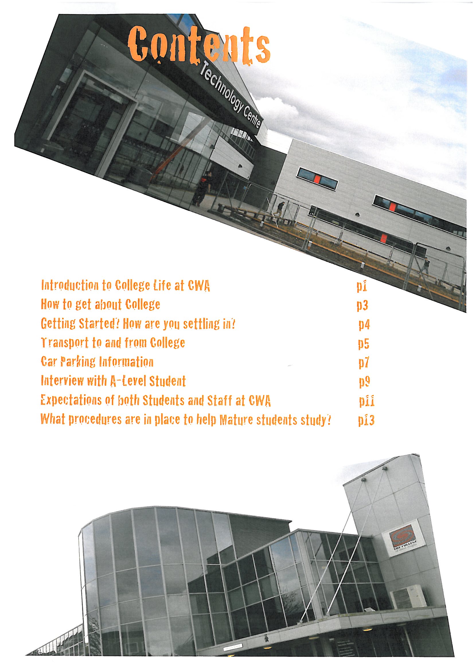
Using "Adobe Illustrator" again I used the same fonts as I used in the Title Page to show continuity in my work. As you can see I took a few more Photos of the Campus and Croped and altered the "levels" of contast in the images using "Adobe Photoshop" once more.
3rd Copy of College Mag
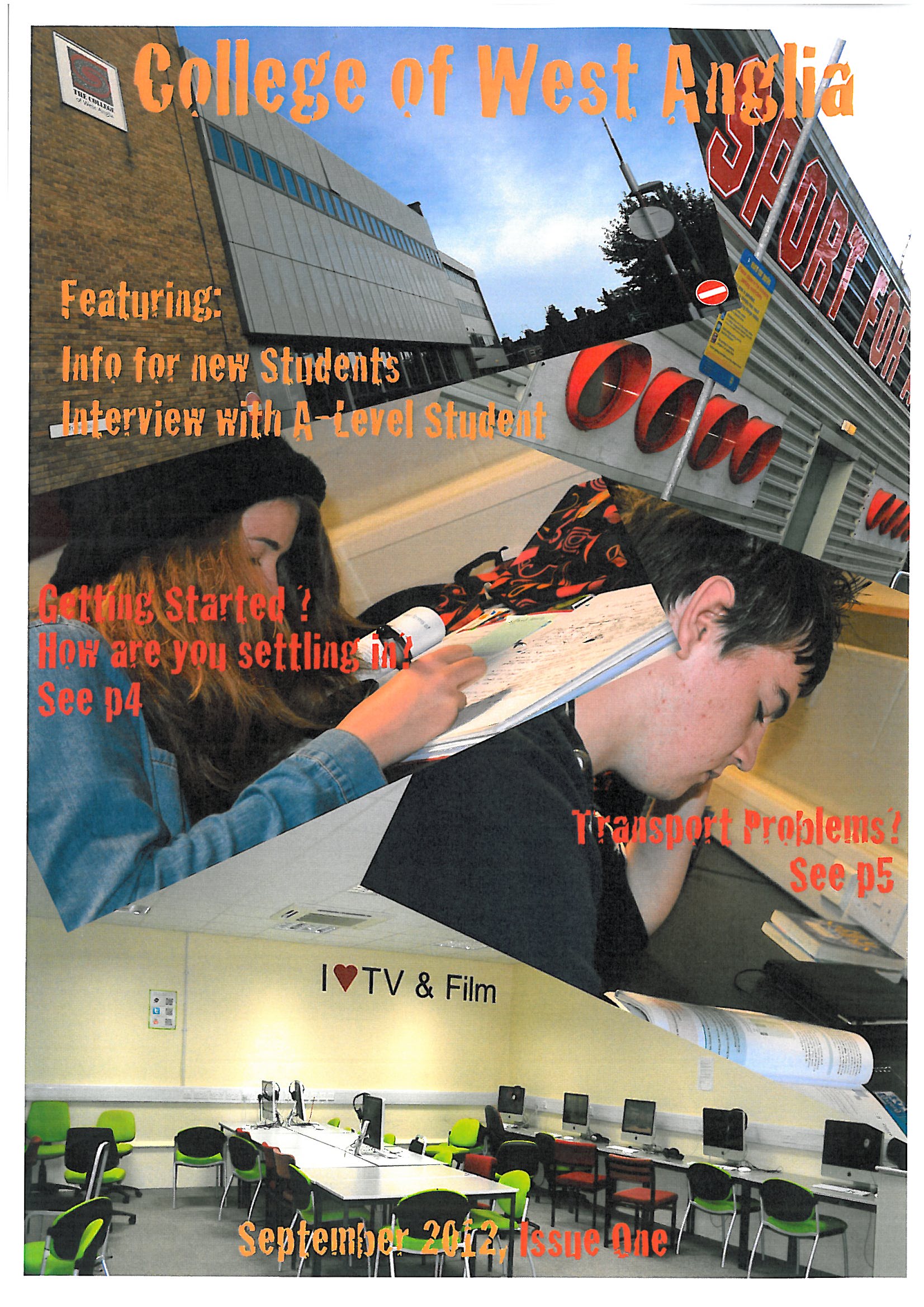
This is the next stage of the development of my title page for the college magazine. As you can see I have taken photos of the campus and fellow students.
I used "Adobe Illustrator CS5" to create the fonts instead of using http://www.dafont.com becasue I felt that they didnt appear the be that appealing for the magazines target audience.
Then I used "Adobe Photoshop CS5" to crop and alter the "levels" of contrast in teh images. Using "Adobe Illustrator CS5" again I rotated the photos to make the title page become more appealing (that I feel that I have achieved").
I will have to do another copy of this magazine cover because I need to change the images of the students to Medium Shots instead of Over the Shoulder Shots.
1st Copy of Contents Page for College Mag
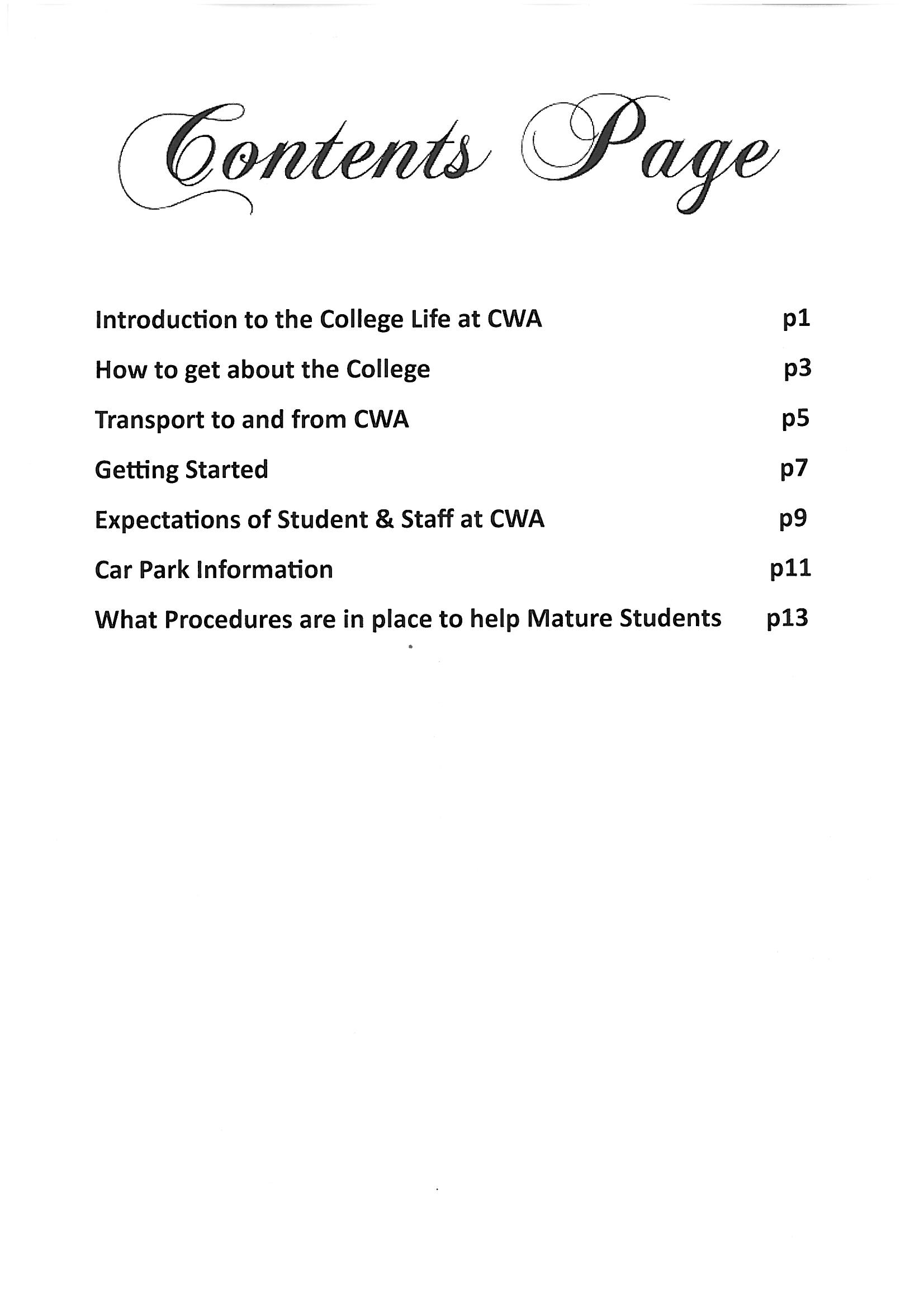
I used http://www.dafont.com/ to create the font for the Title, (Calligraphy-Channel) also I used Microsoft Publisher for the Page template and text.
2nd Copy of College Magazine
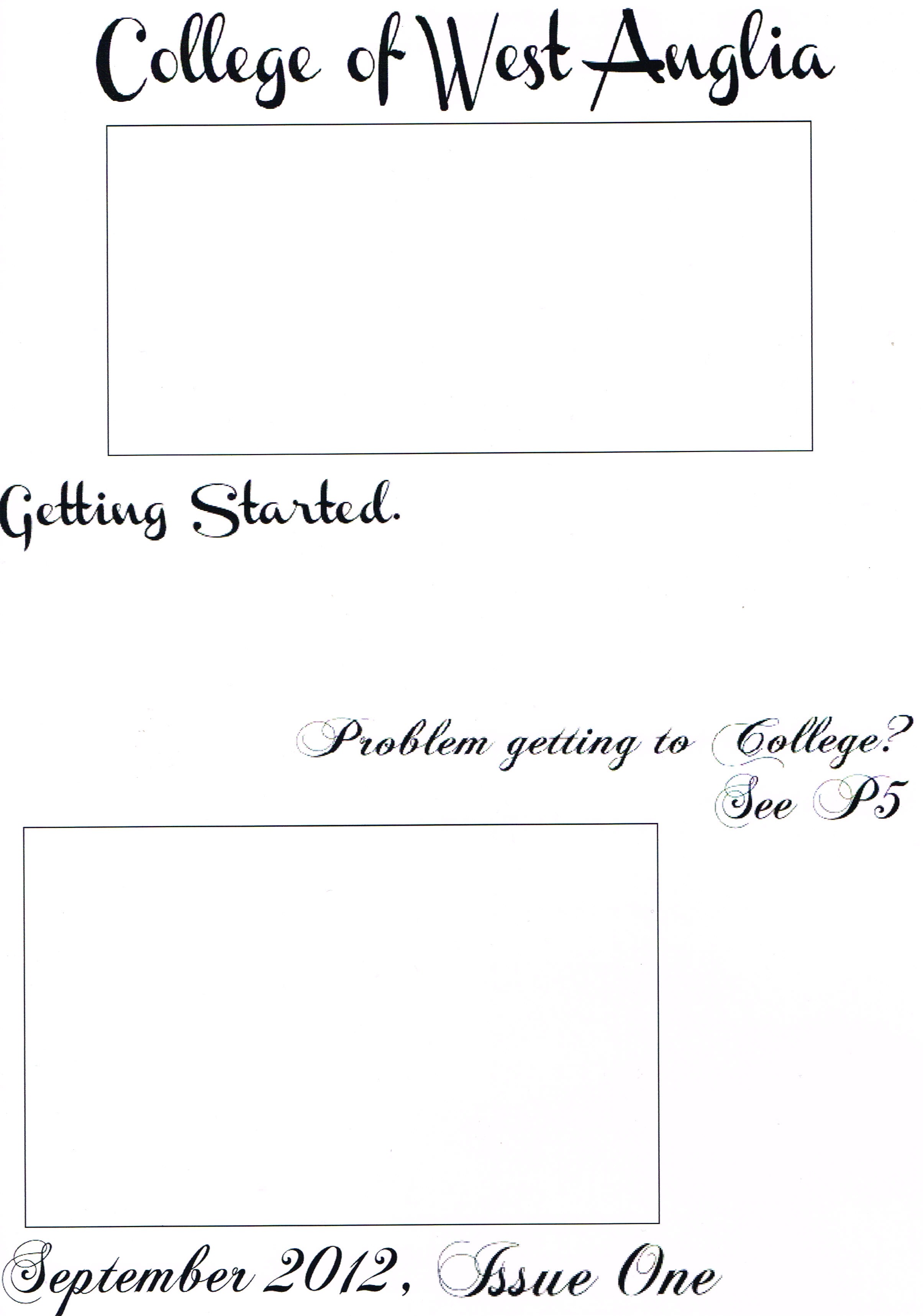
This example of the Front Cover of the CWA Magazine was created using Miscosoft Publisher "Blank Template" and http://www.dafont.com/ is create the Title and Sub-titles in Calligraphy - Channel and Chopin Script (Name of Fonts). The Boxes represnt where the photographs will be going.
I am posting this to show the procession from the rough sketch perviously to this stage.
Rough Draft of College Magazine 1
Types of camera shots
- Establishing Shot (EST) - Establishing where the action takes place- sets the scene e.g. exterior shot and usually wide shot (WS)

- Wide Shot (WS) - Often (But not always) used as an establishing shot- the reason for this is to show the subject's surroundings

- Long Shot (LS)- A shot which shows all or most of a fairly large subject (for example: a person) and usually much of the surroundings

- Medium Long Shot (MLS) - Knees to Head with some background

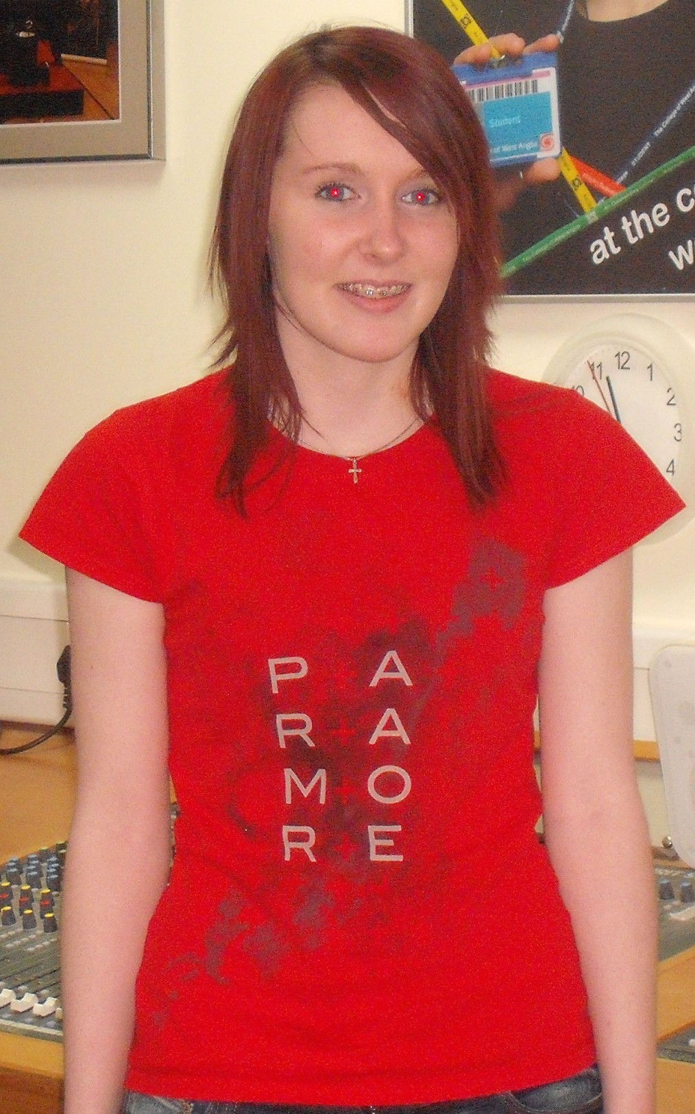
- Medium Shot (MS) - Waist to Head
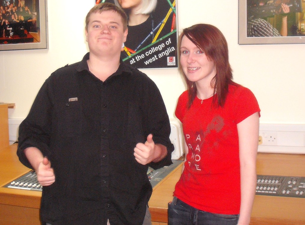
- Medium Two Shot - Waist to Head with two people
- Medium Close-up (MCU)- Head to Shoulders

- Close-up (CU) - Shows a chatacter's face and this is used to show emotion

- Big Close-up (BCU) Forehead to Chin - used to show detailed emotion and facial features

- Extreme Close-up (ECU)- A very tight shot (e.g. a characters eyes or a door handle)

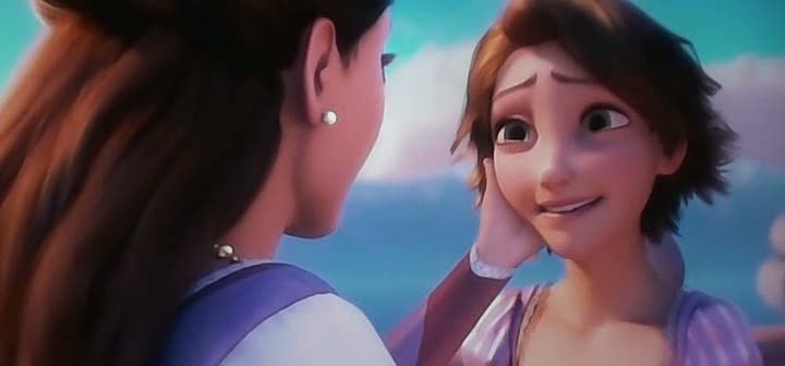
- Over the Shoulder (OTS)- Used during conversation - MCU + other person shoulder/head, back etc
- OverHead Shot (OH)- Camera will be directly over the objects/actors

- High Angle (H/A)- Could be used to make the object/person powerless because they are looking down on them (belittling the character)

- Low Angle (L/A)- Could be used to make the object or charatcer powerful

- Deep Shot (DS)- When something is in the foreground and something else is in the background

- Eventhough this list is different types of shots the directors can used two or more different types of shot in one shot e.g.-

This is a "High Angle" and "Over the Shoulder" because it this making Bella appear powerless whilst she is having the conversation with the vampire.
Genres of Magazines and where they can be found
- Music- Found in Music Shops, Newsagents and Supermarkets

- Beauty- Can be found in Supermarkets, Newsagents and Hairdressers and Salons

- Hair- Found in Hairdressers and Supermarkets

- TV

- Health and Fitness

- Adult

- Horseriding

- Fishing
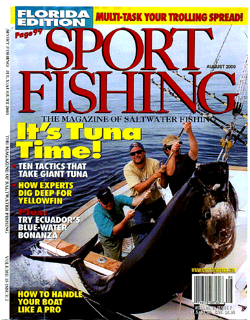
- Hunting

- Guns
- Sports

- Home and Gardening

- Monthly Edition- Collectors Magazine

- Online Magazines

- Martial Arts

- Photography- Found in Jessops and other photography and media shops

- Media- HMV, Supermarkets

- Film/Cinema- found in HMV, Cinemas and theatres

- Food- found in Restruants and health clinics

- DIY- Found in B&Q and HomeBase

- Comic- Could be found in Comic shops and Online

- Antiques- Found in Antiques Shops, Pet Shops ETc

- Maternity- Found in Doctors, Supermarkets and maybe community centres and mother meeting
- Pets- Found in Pet Shops

Subscribe to:
Posts (Atom)


